Tommaso Armstrong
Hi, I'm Tomm 👋
I’m a Human Computer Interaction PhD student at the University of Technology Sydney with undergrad degrees in Computing and Design Innovation. My research examines how social platforms shape the experiences of queer young men and explores how their design could be improved.
I also teach into Interaction Design and Design Innovation subjects at UTS. Working with students to help them expand their thinking and develop their ideas is one of my favourite things to do.
I'm fascinated by the interactions people have with technology and by the ethical, philosophical and societal implications surrounding them. I'm passionate about using design for good and promoting inclusion, accessibility and well-being.
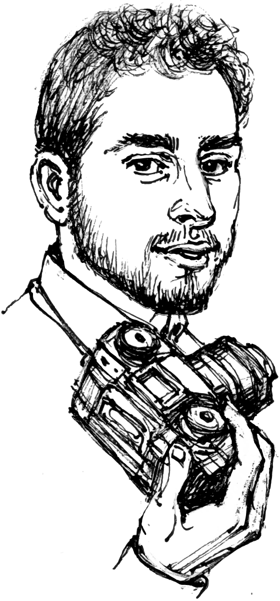
If I'm not working/studying, I can usually be found out on the street with my camera, buried in a tech/sociology book or hacking on side projects.
You can find my ramblings on Mastodon, my photography on Instagram, and my CV here. If you'd like to email me, feel free to reach me at hi@tomma.so.
Government House Data Visualisation

At the end of 2015, the Governor, His Excellency General David Hurley AC DSC (Ret'd), had just completed his first year in office. At the beginning of that first year, he and his staff had determined strategic priorities for who in the NSW community the Governor ought to spend his time with to make the best impact. The Governor had logged nearly 2000 events in his diary, but the staff at Government House Sydney were having difficulting extracting insights from that data trail.
The Governor approached the Vice Chancellor at UTS with a brief to make sense of his calendar data and present it back in a way that he and his team could use to inform their strategic planning. A team of six was assembled to tackle the brief that consisted of, three academics: one from each of data visualisation, typography, and accounting, and three students, one from each of visual communications, social and political inquiry and IT (me).
We started the project by seeking to understand the way the Governor operates and his role in the community. As part of this, we met with the staff of Government House Sydney and conducted desk research about the role of the Governor. We learned about the way the Governor's time is scheduled including how conflicts are dealt with, how engagements are run and about his strategic goals.
Based on this information, we started to map out the type of information that would be useful to have. For example, knowing which categories or themes had the most or least engagements, or how engagements in each theme were spread across different types of events. Working with the designers, I helped sketch out the various visualisations we were going to produce. Having an idea of what we were going to build, I used Python to wrangle the data and R to bring the sketches to life with real data. The visualisations got a final touch up in Illustrator before being added to our A1 template along with a written summary of how to interpret them.
We presented the final visualisations (which are shown below) and an accompanying report responding to the brief, communicating insights from the data and making recommendations, to the Governor and his staff at Government House Sydney. In a letter to the UTS Vice-Chancellor, the Governor wrote:
I had not envisaged the depth and breadth of analysis that was possible from the (sometimes) crude data which we had available — an area in which we are striving to improve.
The quality of the information was surpassed only by the calibre of people presenting it. I was impressed by what the students had been able to interpret from the data provided about the role of the Governor, the role of Government House, and the social and psychological impact that it can bring to the community. It reflected, in my mind, a degree of empathy and emotional intelligence which, when coupled with the skills and expertise of the personnel involved in the project, ensured a well-rounded and profoundly informed report.
The UTS Newsroom ran an article on the project detailing our efforts.